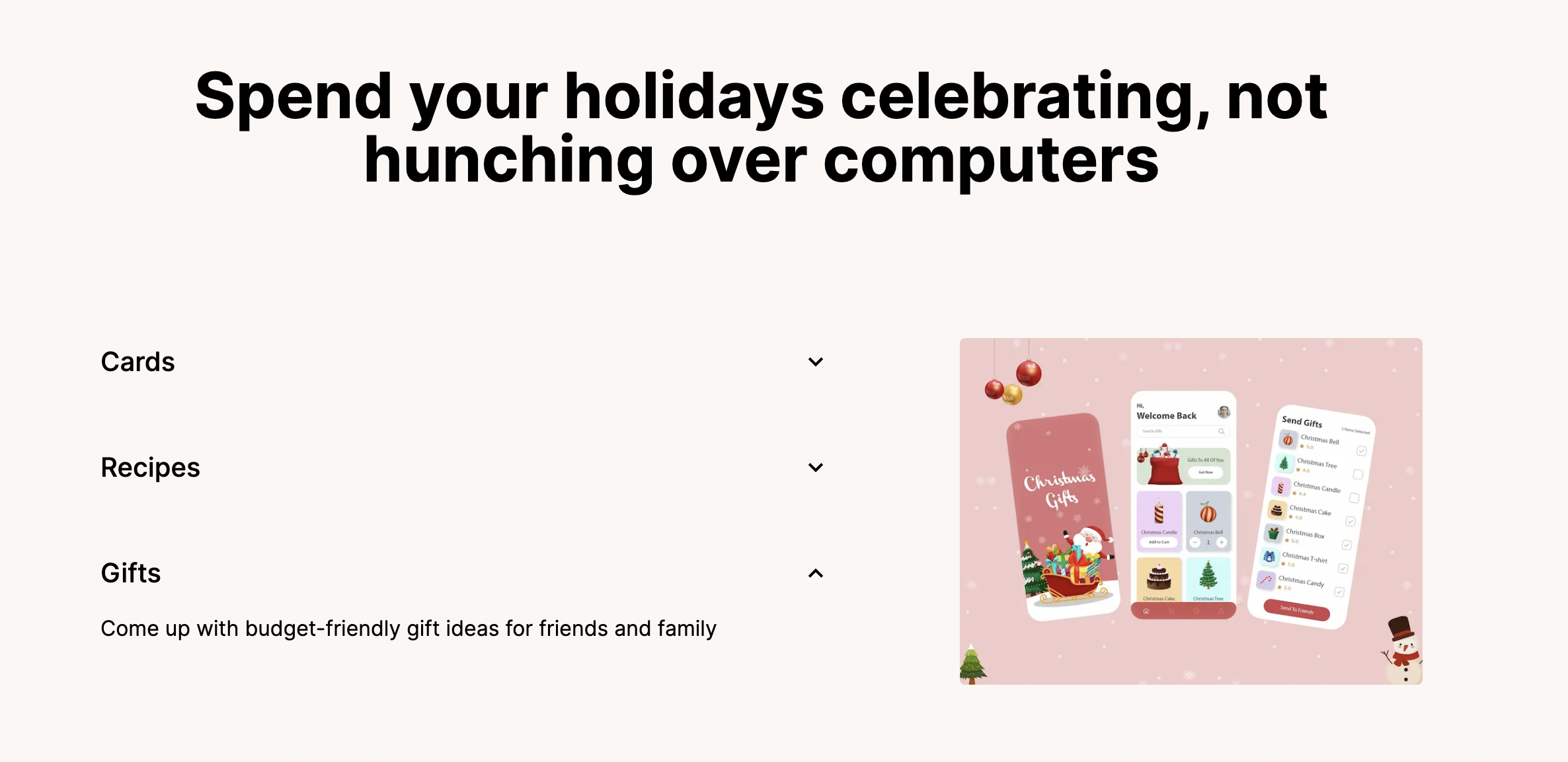
Feature Accordion
A component to showcase different features of your app in an accordion-style interface. Users can expand/collapse individual features to learn more.
Each feature can also showcase a supporting media, which could be an image or a video (or nothing). Videos are set to autoplay on mute.

import FeatureAccordion from "@/components/FeatureAccordion";

...

<FeatureAccordion />
You can customize the content for this accordion in @/config/content.ts:
...
export const features = {
    ...
    list: [
        {
            title: "Pixel-perfect generation",
            description: "You'll never know if it's fake or real.",
            ...
            media: "screenshots/pixel-perfect.png"
        }
    ]
}
Last Updated: June 7